SpringlePortfolio

Designing a catering menu app for a wedding venue
The problem:
Catering apps can be intimidating and confusing with not very clear navigation and hidden costs. Communicating with the caterer as soon as inspiration strikes can be difficult long winded.
The goal:
To create a design that is clear to understand, clear to navigate even for those who don’t use apps often that sets clear budgets and well laid out plans at anytime of the day.
My role and Responsibilites:
Lead UX designer and UX researcher
Conducting User research, Creating personas, Identifying Pain points, creating the design, wireframe and Prototype of the new app
Research
I assumed that the user would want a picture based menu with a sleek clear design
Based on my research the app needed to include clear pricing with clear photos and descriptions of the food. The app needed to be easy to use and well laid out to be able to navigate without issue. Communicating ideas out of hours was also important as a lot of users would be in bed scrolling menus and found calling the cater only inconvenient
Price
Users want the pricing of items written clearly so there is no hidden surprises and they can plan their menu within their budget.
Not regular user of Apps
A lot of my users don’t use apps often and find downloaded a new app to plan the catering for the wedding intimidating.
Out of hours
My research found that people would be using the app at unsociable hours, quite often in bed. They want to make changes wherever they are.
Visual
When looking at food options, pictures are needed to visualisee the food and help entice the user to choosing their option, It also helps those who do not want to read descriptions.
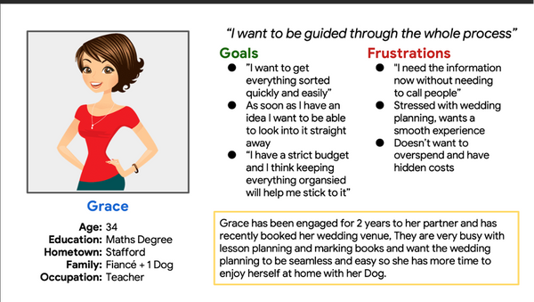
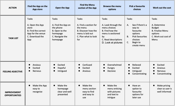
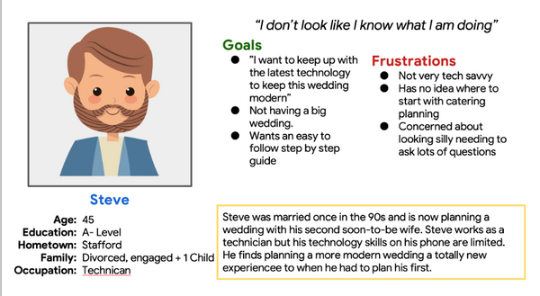
Personas and their User Journey

The Design

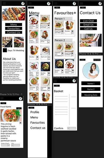
I designed a few options for my app on how I want it to be shown to the user. I added a star on elements I felt were suitable for the final product.
I felt the app needed lots of pictures as well as clear guidance. I wanted to use clear symbols to show the favourites.
I then converted my drawings on to Figma and added more pages and elongated the screens to symbolise scrolling through the App. I wanted the pricing to be clear and more information on the food available when requested. I also wanted to make sure the contact us screen was available with multiple options for out of hours communication


I then made the Wireframe interactive for a Low-fid prototype to be able to test on participants and made sure all the buttons worked well and were easy to navigate.
Testing
I conducted a Moderated Usability study with my peers to test the use of the product.
-
Users found the Low-Fid layout hard to visualise the final product
-
Users wanted more text alongside symbols
-
Users found the app “fairly self-explanatory”
High-Fidelity Prototype
Adding the images and texts really made the app look real. I added hamburger menus and cards with smaller information to make a responsive multi-column layout

Conclusion
-
Upon reflection on my very first project, I was proud of how I adapted my drawing to a Wireframe. I enjoyed adding the interaction and helping it come to life.
-
I am excited for my knowledge to grow and to be able to add more features to my high-fidelity prototypes. I would like to improve my testing and research skills as more resources become available, as this was my first project my sample size was small containing people close to me which can risk Friendliness bias.
-
-