SpringlePortfolio
Family Schedule Website
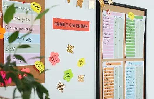
The Problem
Organising and communicating with your family is hard in a busy household. To have plans, appointments and to-do lists all in one place will help keep the family flow.
The Goal
Create a multi-screen family scheduling website so all family organisation is in one place.
My role and Responsibilites:
Lead UX designer and UX researcher
Conducting User research, Creating personas, Identifying Pain points, creating the design, wireframe and Prototype of the new app
Research
I conducted interviews with a range of users from different backgrounds with families to discover what the common wants and needs were for a family scheduling Website
Based on Research it was clear communicating important dates and appointments needs to be shared amongst parents to share the mental load of information. All family members need to have access to keep on top of the schedule at any time. Live changes to the website and app need to be instant to confirm tasks have been done or something has been booked on a date so things do not clash.
Communication
The Website needs to help communicate all tasks and dates within the family so everyone is prepared
Mental Load
The Website needs to be used to relieve a mental load from parents to the tasks and appointments are shared and not relied upon one person to remember or inform
Live Changes
Additions, changes and completions need to be updated instantly to avoid clashes of double booking or completing tasks.
Shared Information
The Website needs to be accessible to everyone in the family to be able to be informed of everything. Additions and changes needs to be for everyone but with potential parental access
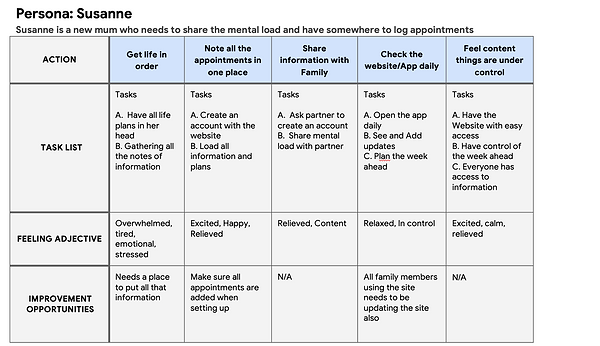
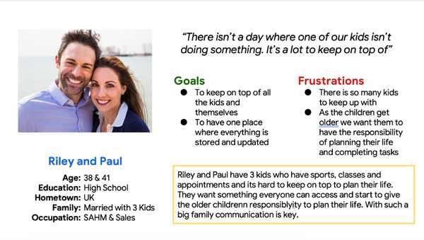
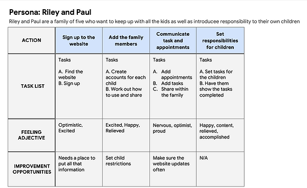
Personas and User Journey

The Design

I sketched out a rough Heriarchal site structure to map out how I would want the site to look before creating my Wireframe
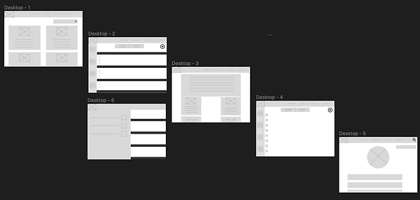
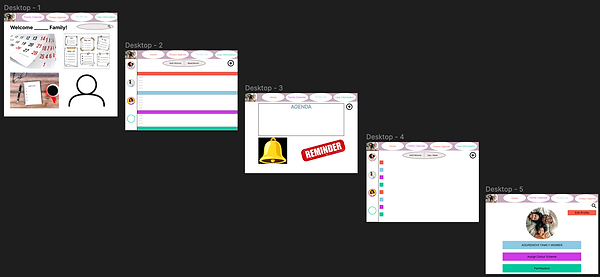
High-Fidelity Prototype
I searched for Accessible friendly colours to make the website bright and fun whilst still being easy to read and use. I added text and customisation to bring it to life and added the interaction to be able test

Testing
I conducted a moderated study to conduct a UAT. I wanted to test how easy it is to navigate through the website. Going forward I would like to test my website on a younger audience as this is aimed at families and to introduce children to family responsibilities.
-
Users enjoyed the colours of the website
-
Users wanted more text prompts as well as pictures
-
Users found the website easy to navigate
Conclusion
As my first Website project, I enjoyed creating with more space expansion. For this project, I made this fun and colourful to make it family-friendly and interesting. If I were do to this project again I would test this on teenage/young adults as well as adults to get a full test on a family